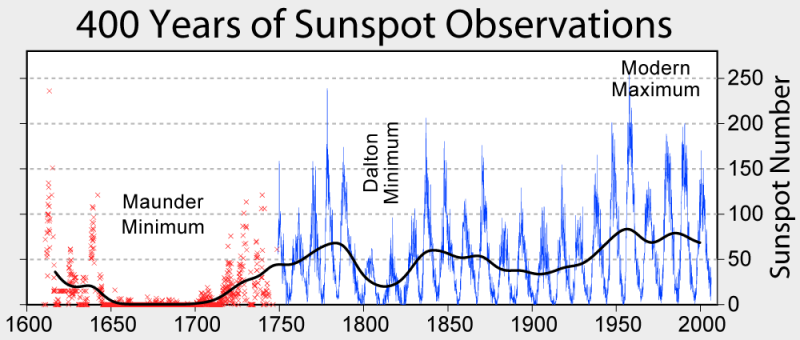
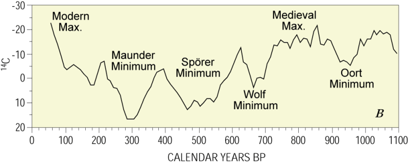
As your own graph above shows, sunspots are a component of solar variation, which itself results from changes in solar radiation. So it's not really that unimportant, I don't think. And the 14C graph (which you did not mention) is also considered a proxy for solar activity.
As far as I know, solar activity is a significant contributor to climate change.
It is true that the solar irradiance is very slightly higher now than it was 300 years ago, however I am skeptical that this explains the rising temperatures. a) The IPCC would have to have really screwed the pooch on this one if they were off by 10 sigmas or so in their uncertainties on the relevance of this effect, and b) you can directly see that in the last 30 years temperatures have continued to rise while the solar output has remained constant.
I have learned not to discount any possibility or place complete trust in the integrity/validity of data compiled, manipulated, and anylyzed by any other scientist. Obviously, we are forced to trust other people's work on many occasions, but I am
always skeptical of data I have not personally analyzed.
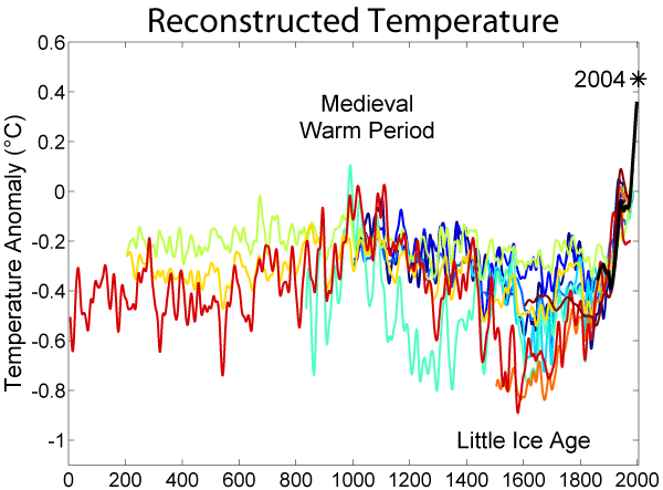
In addition, I know it's hard for some to understand, by I simply cannot accept and draw any conclusions from 30 years worth of data. That is an exercise in futility, as far as I'm concerned. Perhaps that is not your intention.
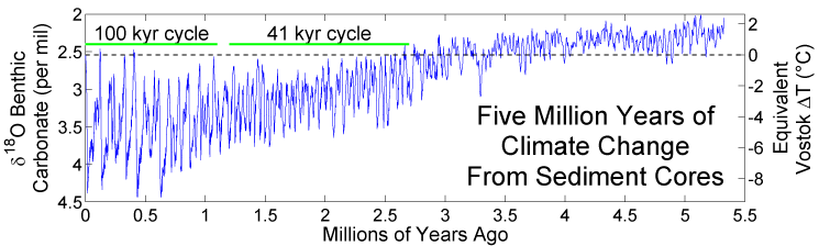
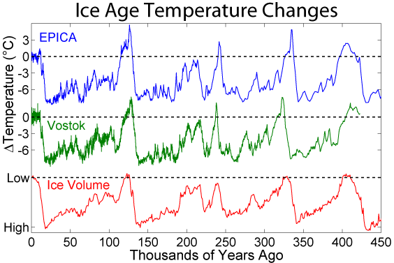
What do those graphs look like when displaying several hundred to thousand years worth of data?
There would have to be some very slow feedback effect in place for ancient solar variations to be causing modern temperature rises.
And is this not possible in your opinion?